Hi everyone... wow where has the last month gone... How did you like the cast shadows challenge.
we have yet another new challenge for you over at Make It Colourful..
we have yet another new challenge for you over at Make It Colourful..
All the details and fabulous inspiration from the the girls can be found over on the challenge blog...

I have done a few projects this month and I will be sharing them throughout the challenge with some detail on how I did them, as I have had a few enquiries on how I use my Ball point pens...
My first project I will share is...

This one of the fabulous new images Zoe has in the Store
I have used ball point pens, for the challenge part I have blended the blue and the green and also blue with purple.. this is just my version of how I use the pens I haven't been using them very long so they are still new to me.
To get started you will need..
your image
a selection of ball point pens
I always work with a piece of old cardboard/cereal box card under my work
a piece of kitchen roll to rest my hand on and to keep wiping the tip of the pens onto


I then added some orange on the bottom of the beak so I can try and get a colour balance between the top and bottom, I usually work on more than one part at once so I don't make it too dark and I can add shading when I finalise the image.


It just takes practise like with any medium and some patience..
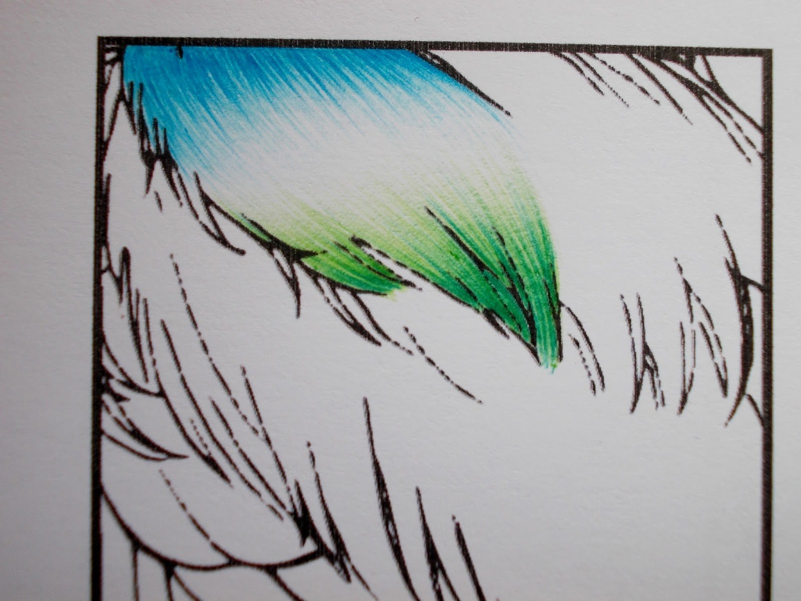
Again with the wings I use the same principal of using light strokes and making them curved..
I used a light blue on the top part of the wing and a light green on the bottom part,, making the strokes quite long again I want to create a lighter area in the middle, where the light will bounce off.


On the green part I added some yellow, you may want to try on some scrap paper first as this can really change the colour of the green, and then it's just a case of blending between the colours untill your happy


I hope you can follow this and I'm sorry it is long... I will be posting some more shorter tutorials soon if any body would like to use them...
Please don't forget to head over to the Inspiration blog and take a look at the awesome work the girls have done.
Thank you so much for stopping by
Hugs for now
Kay


4 comments:
You really are inspiring me to work with the pens. This is a five star - drop dead gorgeous coloring! I am really super impressed! Five stars*****
Awesome colouring 😊 ... Stunning end result, saw it on Facebook... Thanks for the tutorial xx
What pens do you use?
This is absolutely, totally amazing... You blow me away with your colouring with ballpoint pens.. So clever and inspirational.
Post a Comment